During episode 5 in season 5 on 'Face Off', each artist has designed their own creatures based on the theme 'Mother Nature Goddesses'. I found the characters very fascinating as the artists have to incorporate the ideas of using elements of their own mothers and an arboretum to recreate a human plants hybrid.
Laura's work:
 |
https://anibundel.files.wordpress.com/2013/09/s05_e0505_spotlightchallenge_
09_137881772894.jpg |
 |
| https://s-media-cache-ak0.pinimg.com/originals/f0/3a/19/f03a19b9d38af22f74ec9115a2bb5efb.jpg |
I love the design that Laura did on above and I like the way how she used the idea of presenting trumpet flowers for the skirt to show the meanings behind that her mother loves to listen to music. The ideas of Laura's design is inspired by caterpillar and venus flytrap and you can see the patterns and the shapes of them on the torso.
There are moss around the neck and a bit on the hair as well. I like the texture of them and I think it works very well with the patterns on the body. There are also flowers decorated on the hair which I think shows the femininity of her mother. I like the line patterns on the arms and it reminds me of the human veins and plants roots. I think the color choices of the design work brilliantly and it links to the color of the venus flytrap. The mode has got bright green contact lenses on which links to the color of the flytrap. I also like how there are purplish grey color of hair around the head which matches the eye makeup and the color on the body and it also shows an elegant style.
Frank's work:
 |
| http://images.wookmark.com/303749_wookmark.jpg |
 |
| http://images.wookmark.com/303748_wookmark.jpg |
I love the shape of the flower petals on the head and I think the fabric and also the petals shows the femininity of a mother. I like the bottom bit of the fabric as it has got some purplish tone blending in with the white color at the bottom. I like the neck and the shoulder area and I think it is very clever that the positions make the design looks like it is part of the clothes. The color choices reminds me of nature and also the warm texture reminds me of mother.
Alana's work:
|
https://s-media-cache-ak0.pinimg.com/736x/62/74/34/6274344dc3fcf9bd18adbcb20687e489.jpg
 |
| http://junkyardarts.com/wp-content/uploads/2013/09/alana.jpg |
I think the big size of the petals on the model's back is very powerful, but he way Alana uses white, yellow and purple give the warm texture and tones which shows the femininity of mother. I also like how on the petals, they are line patterns on it and I think it was done in details. The white costume and the layers on the costume reminds me of the flowers. I think the shape on the top of the head looks like the petals of the flowers and the shapes on the face reminds me of the leaves.The model has got black contact lenses on which I think is to stand out the white and the purple tones on the face.
Laney's work:
 |
| http://junkyardarts.com/wp-content/uploads/2013/09/laney1.jpg |
 |
http://static.wixstatic.com/media/99fd8a_ed919acffe4a4acda6f8ce04469e882f.
jpg_srz_705_1053_85_22_0.50_1.20_0.00_jpg_srz |
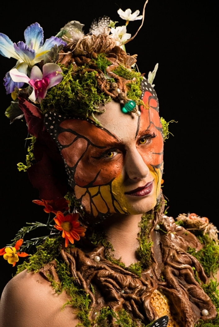
I love the patterns of the roots on the head and around the body and it has got a lot of details involved. I also like how there are moss and flowers around the roots which makes the look more realistic. Laney's work is inspired by butterfly and as you can see the model's face has got the patterns of the butterfly. The body was covered with moss and there are butterflies on the body as well. For me, I personally think the costume of the fabric at the bottom is quite disappointing as I think it doesn't fit in with the design.
Roy's work:
 |
| http://iv1.lisimg.com/image/9163477/620full-face-off-photo.jpg |
 |
| http://www.syfy.com/sites/syfy/files/styles/syfy_image_gallery_full_breakpoints |
Roy's work is inspired by trees as he thought his mother was like the tree which made the family grew. I found the design very clever as he uses grey tones instead of brown for the branches and you can see on the close up photo, the grey tones blend in with the human skin color which makes a natural finish. The pink chiffon gives a more elegant style which represents a mother character. Roy's character is the only character which does not wear contact lenses, bu the color of the model's eyes matches the grey tones on the face and the body beautifully. The flowers on the tree which makes the character look more feminine and I like the patterns of the branches which was done in details. I also like the idea how the shape of the collar bones have changed and it looks like the branches are growing from there. The black lips matches the grey tones very well and it helps to create a more dramatic look. I like the roots at the bottom and it is one of the important features of the trees. The way how the roots goes from different directions remind me of a skirt.
After looking at different designs, it gives me the ideas of how I should present my ideas (the way by using costumes or props are also very important and I can use props or costumes to present and symbolise the ideas I want to present through my design). The color choices are one of the points that I need to think about when designing and the way how I should position the props are one of the important issues as well.
References:
- http://www.tvequals.com/2013/09/10/face-off-season-5-episode-5-mother-earth-goddess/


No comments:
Post a Comment